30-second summary:
- Landing pages can help you appeal to your audience, so they want to stick around and make the switch to a paying customer.
- The structure of your landing page is just as important as its content and should lead the human eye directly to the CTA.
- The top 25% of landing pages convert at 5.3% or higher relative to the average conversion rate of 2.35%- it pays to optimize your landing page.
- The anatomy of a landing page is key to increasing conversions; by strengthening first impressions, embedding psychological trust, capturing email leads, demonstrating UPS, and illustrating social proof.
A high proportion of landing pages convert well as they are created following key fundamental steps. This is largely down to the structure of a landing page as it aligns with persuasion, including elements that help to persuade.
A landing page with a high conversion rate is the solid foundation of a successful online business. The average landing page conversion rate across industries is 2.35%, with the top 25% converting at 5.31% or higher. As a business, no matter the conversion goal or the intended audience, following a set of structural rules can elevate your business.

Source: WordStream
For this specific reason, it is essential to understand the anatomy of a landing page to help boost your business, prompting better results. In most cases, all landing pages look poles apart but read in between the lines the same. Below, we will discuss the structure of landing pages in more detail.
Landing pages – understanding them
In marketing, a lot of time and effort is spent on driving traffic to a website. The intention is to reach the target audience with a hope that they will interact with the site and join the opt-in action, which might be in the form of subscribing to a newsletter or signing-up.
However, this does not always entice an audience into the sales funnel, converting them into customers. For this reason, landing pages are crucial and are at large, consist of effective content, graphics and call-to-actions (CTAs).
What is a landing page?
In all cases, a landing page is a web page that all site visitors are sent to initiate a conversation attempting to close a deal. Some of the most effective landing pages are stand-alone pages that are created for a single purpose where the CTA is pointed directly at the targeted audience. To get a higher conversion rate on email marketing, your landing page ought to give your visitors positive user experience.
To be frank, landing pages live separately from your initial website. They are designed only to receive campaign traffic. Separating them from websites allows organizations to focus on a single objective, making analytics easier, and testing simpler, which we will look at in more detail below. A landing page can be used for almost anything. However, the purpose of the page needs to be clear with a definitive link to an appropriate call-to-action.

Source: Nike
For example, taking a look at the landing page above created by Nike, it is immediately evident from the onset precisely what product they are promoting, with a small purpose text and a call to action. The use of different colors also plays a vital role which will explore later.
Why you need a landing page
Landing pages are used to achieve particular goals. These can be either to build an email list, grow a brand, or to make a profit.
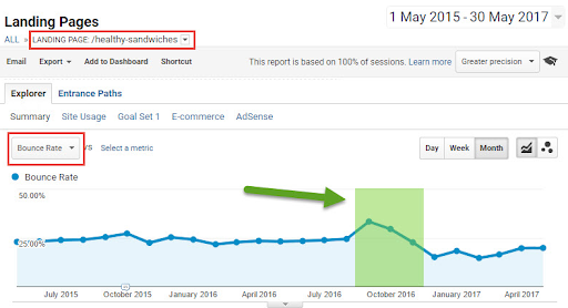
Source: Hallam
Landing pages also offer essential metrics for measuring the success rate of your business’s marketing campaign. By looking at the graph above, it is evident that by analyzing a single landing page, organizations can see the history of important metrics such as bounce rates.
At the core of a landing page sits an opt-in process for page visitors. The landing page metrics give organizations the clear insight they need to grow their business in the right direction successfully.
Here’s a look at numerous benefits that businesses can gain by producing specific landing pages.
Promote a positive first impression
If you consider that there are far more interesting pages to look at online in comparison to your landing page, you will begin to understand that the duration of time visitors spend on your site will be relatively low. For this reason, first impressions count. Landing pages aid businesses to appeal to their audience, transitioning them from a reader into a solid customer.
Use trust elements to your advantage
Images, graphics, and videos can attract visitors and have a way of persuading them emotionally to take action. Many psychology studies have indicated that people respond better to visual information than to text, resulting in much more positive user experience. Doing so can produce spectacular results, potentially giving business over a million unique visitors from Google alone.
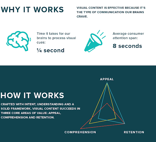
Source: ColumnFive
The image above indicates processing visual content can be done at rapid speeds with greater retention and appeal, making clear that understanding visual content takes a small fraction of your reader’s attention span.
Increase conversion rate
Landing pages allow you to increase your conversion rate as it is easier to capture email leads from them in comparison to a typical blog. This is because a landing page has only one purpose. A website or a blog focuses on highlighting trending posts, recommending affiliate products or services, whereas the landing page is solely focused on the CTA.
Now we’ve spent a little time looking at what landing pages are, let’s now dissect the anatomy of one, focusing on the key components of a successful high-conversion landing page.
The components of a successful high-conversion landing page
What is your unique selling proposition as a business?
No matter what industry or field your business participates in, a fierce competition is always inevitable. As a business, your unique selling proposition is what sets you and your competitor’s miles apart. Your USP on your landing page is how you decide to position your offering differently.
Landing pages need to communicate this proposition in a succinct way sufficiently. Why? So your visitors can immediately understand what makes your product or service far more appealing compared to others alike. To do so, you must follow and include page elements that aid in telling your story clearly.
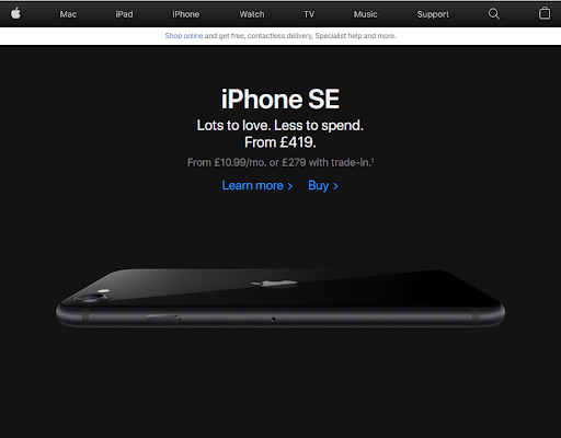
Source: Apple
The main headline: One of the first things visitors will see and read is the headline. For this reason, it needs to be precise. Keeping the headline punchy and to the point is a must, being direct about your USP is vital. As demonstrated by Apple’s landing page above, they have decided to make the headline their product name, making clear what the landing page is promoting.
Supporting headline: As our heading needs to be short and sweet, additional context can be offered in the form of a subheading, adding a touch more information. The shorter the subheading, the better, as exemplified on Apple’s landing page. A subheading can have two approaches. The first being a direct extension of the headline itself. The second is offering additional information, conveying a secondary message that is persuasive. Apple has chosen the latter, by using the word “love” it adds an emotional element of persuasion.
Reinforcing statement: This is optional and depends on the length of your landing page. If the landing page runs long, you will want to add a reinforcing statement towards the middle of the page to help remind visitors of your USP. However, the reinforcing statement can also be used to persuade, as Apple has done so, by including prices and offering a “trade-in” option.
Closing statement: a closing statement is typically used to back up your USP, giving your visitor one last chance to convert into a customer. It is thought to be the climax to your offering, so making it count will pay off. A strong closing statement will help remind the visitor why they are on your landing page along with a repeat CTA with a little urgency.
The hero image or video
As mentioned above, first impressions are paramount, and so, the hero image is the first visual your visitor will see on your landing page. Hero images are thought to be the primary image that helps to convey your message. The image should clearly demonstrate and convey and communicate the use of your product or service as demonstrated by the below image from Mercedes-Benz.

Source: Mercedes
With that in mind, some businesses prefer to use text-only landing pages that do not include videos or images. The purpose of this strategy is, since page loading times affect Google rankings, text-based landing pages load with speed, increasing the user experience. However, as we explored above, the retention and processing of text is much slower,
Video landing pages have become increasingly popular over the years thanks to sites like YouTube and Vimeo. Research has shown that one-third of all online activity comes from users watching videos. Videos are also increasingly interactive and help to demonstrate how your product or service works transparently.
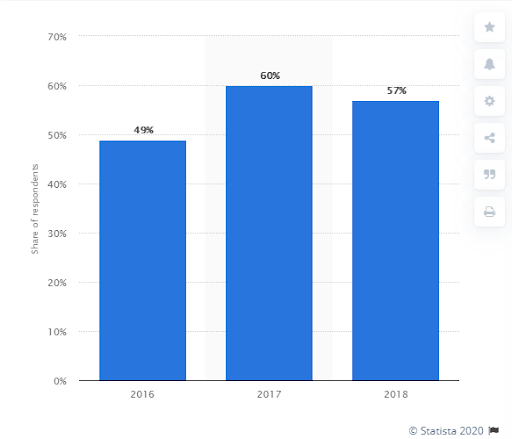
Source: Statista
The graph above provided by Statista indicates the share of businesses that were using videos on their landing page worldwide between the years 2016-2018. As you can see there was an 11% increase between 2016 and 2017 which is considered to be quite high and a 3% decrease in 2018, which is relatively low. Considering economic issues, it seems videos that are present on landing pages are proving to be successful for businesses.
The benefits of your offering
One of the main components of your landing page is the copy that is placed on it which helps to persuade readers. The key to your copy is to describe the specific benefits of your product or service along with flaunting its features. The feature helps to demonstrate a particular quality of your product and the benefit describes its positive impact. To drive and increase conversions, it is better to show off features and benefits together as Apple have done so with their “Lots of love, Less to spend’ copy. In this case, the feature of the product is what it can do for the customer, and the benefit is the price.
A form of social proof
Landing pages that convert well have examples of social proof that can be used to help influence your reader’s decision making. Pictures of customers, social media posts, and testimonials of users using your product help to build trust and help gain conversions. Large organizations such as Apple mix between using this strategy. The image below clearly indicates the benefits of social proof.

Source:Unbounce
Conversion goal – CTA
The landing page’s key focus is a conversion goal, getting visitors to follow the CTA which can be a stand-alone button, a click-through page or a form designed for lead generation. When creating your CTAs, it would be wise not to use a bland button with text that says ‘click here’. Using conversation language as Apple has done so will let visitors know exactly what to expect when clicking on it if you opt to use a form, keep it short while including a privacy statement reassuring visitors that their data is safe.
Considering the psychology of color, Apple has used it to their advantage. Using the right colors help improve landing page conversions. The color blue is thought to make readers feel peaceful, which is the color Apple has chosen for their CTA text. The text also stands out from the other colors used on the pallet of the page.
Increasing your landing page conversion rate
Market research
Conducting market research is essential for your landing page. Gathering vital information surrounding your target audience and customers will assist you in creating a valuable and desirable customer experience. Doing so will help you gain an insight into the topics of interest surrounding your target market, allowing you to create a streamlined, well-targeted landing page.
A/B testing
Testing landing pages is vital. A/B testing is the process of running a simultaneous experiment between two or more pages in the aim to see which pages perform the best. Doing so can help gather evidence considering variations between texts, heading, and images.
Gathering metrics from analytics and A/B testing platforms like Finteza and Optimizely can help you make clear and concise decisions based on first-hand data collected when considering the behavior of your audience.
By seeing the effectiveness of a specific landing page, you’ll be able to make more informed decisions when it comes to allocating marketing budget and spending time. 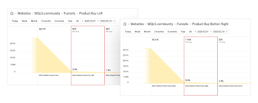
Source: Finteza
The impact of testing can largely elevate your business as President Obama raised an additional $60million dollars by using A/B testing in his last campaign.
The post Studying the anatomy of a successful high-conversion landing page appeared first on Search Engine Watch.
from SEO – Search Engine Watch https://ift.tt/2YpbWki
via IFTTT

No comments:
Post a Comment